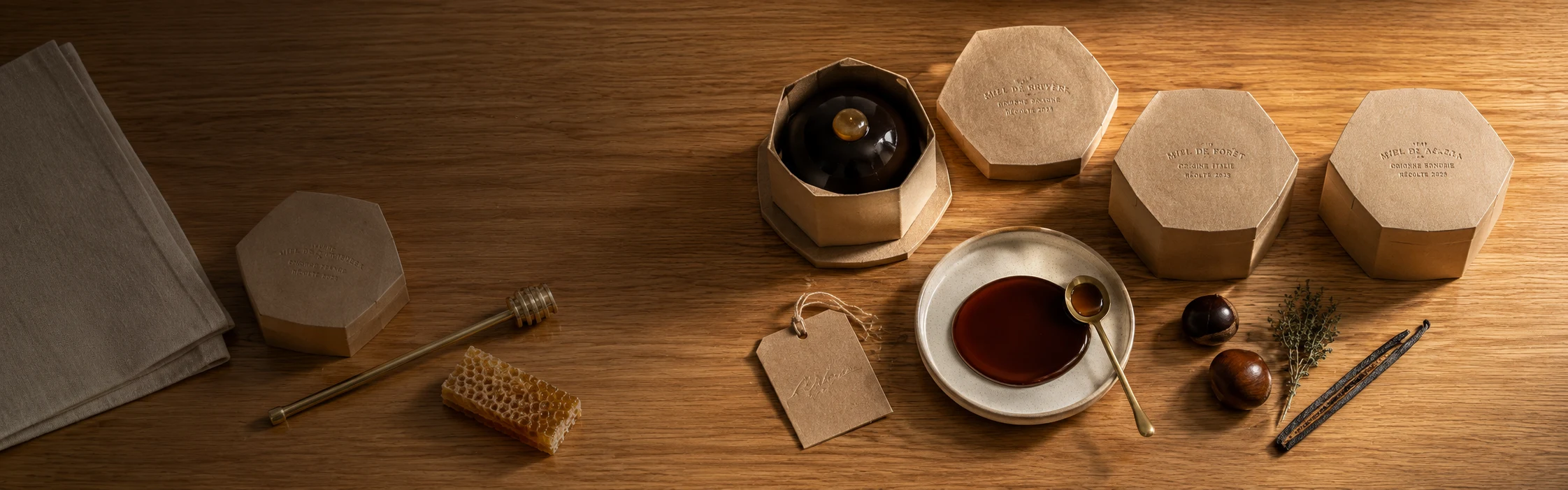
The hexagon — material language
On the maison's geometric signature, the unbleached kraft packaging, and the choice to leave information in the material rather than printed on it.
The maison's first design decision was not a logo. It was a shape.
Before any creation was finalized, before the recipes for the debut capsule were locked, before the chef even knew which apiarist she would partner with, the form of the packaging cell was chosen. A hexagon, in unbleached kraft, debossed without printed ink. The information lives in the material; nothing is added that does not need to be.
The choice was made in October 2025, and every subsequent decision has been arranged around it.
Why the hexagon
The hexagon is, in geometry, the most efficient shape for filling a plane without waste. Six straight sides; six identical corners; a tile that meets its neighbors with no gaps. A square also fills a plane, but its corners meet at four-vertex points that are structurally weaker than the three-vertex points of hexagons. A circle is more efficient by area but cannot tile at all.
In nature, the hexagon is what work-pressure makes when it has the time to settle. The cells of a beehive are hexagonal not because the bee draws them that way — the bee draws circles in soft wax. The hexagon forms afterwards, as the circles, packed in three-dimensional tension, settle to their lowest-energy state. It is the shape stability arrives at when nothing else is forcing the geometry.
The maison's first capsule, Le Rucher — French for the apiary — is a monograph on seven single-origin honeys. The hexagon would have suited the capsule even if no other capsule ever used it. But the choice was not made for Le Rucher. The choice was made for the maison. The hexagon is the maison's permanent material signature. Every capsule, every commission, every box of work that leaves the kitchen carries it.
The packaging — what we made
The maison's pieces ship in hexagonal cells of unbleached kraft board, sized to the work inside. A single creation sits in a single cell. Seven cells of a monograph capsule nest into one block — the Ruche — a full set arranged in a honeycomb pattern, sold as a unit at the capsule's open. Individual cells remain available on their own.
Each cell carries, debossed into the kraft, four pieces of information:
- The varietal of the ingredient inside
- The GPS coordinates of the apiary or farm that sourced it
- The year of harvest
- The name of the maker who supplied it
That is all. There is no logo on the cell. There is no maison name. There is no QR code, no website URL, no marketing copy, no decorative motif. The information that matters about what is in the box is on the box. Everything else is left to the work itself.
Debossing without ink
The debossing — pressed into the paper rather than printed on it — is a slow choice. Printed kraft is the cheaper option by an order of magnitude. Foil-stamping is more eye-catching at retail. We rejected both.
Printing puts a layer between the paper and the information. The reader sees the ink first, the paper second. Debossing reverses that: the paper is the surface, and the information lives in the paper's depth. The hand, running across the cell before opening it, finds the lettering before the eye reads it. The information is part of the material, not laid on top of it.
This is more than an aesthetic choice. It is an information-design choice. A printed kraft cell, after a season in storage, can fade. A debossed cell, in the same conditions, holds. The information ages with the paper, not against it.
There is also a quieter reason. Ink, in pastry packaging, leaves a chemical trace — minor, regulated, but real. Debossing is dry. There is no migration of solvent or pigment near the food the cell carries. It is the cleanest available method.
What the cell tells the guest
A guest who receives a box from the maison reads, first, the material. Unbleached kraft has a color the eye recognizes as natural — not the bleached-white of commercial packaging, not the printed brown of supermarket boxes. The texture is rough enough to find the debossing.
Reading the debossing, the guest learns:
- What is inside — the varietal of the ingredient
- Where it came from — the coordinates, which can be looked up
- When it was harvested — the year
- Who made it — the name of the apiarist, the dairy, the cacao farm
This is the maison's commitment to traceability, made visible in a way that does not require a label or a QR code. The information is permanent on the cell.
The maker's name on the cell is a contract. If the maison ever changed which apiarist it sourced from, the cell would change. There is no version of "the maison's standard honey" that floats free of a named producer. Every box is signed by both the maison and the maker who supplied the material.
The block — the Ruche
When the maison opens a monograph capsule, the full set of seven cells assembles into a block — the Ruche. Seven hexagons, nested into a single honeycomb pattern, held with one outer kraft sleeve. The block ships before individual cells; it is the form a guest buys when she wants the complete capsule.
The block is also a closing form. When the capsule ends, the maison has shipped only as many blocks as were composed. There is no remainder to discount or repackage. The block is a literal expression of the capsule's countedness.
For the maker, the block is the moment the capsule's design becomes a single object. The seven études of Le Rucher are seven separate creations on the kitchen bench. They become a maison de saison only when they fit, together, into the seven hexagonal cells of the Ruche.
What the material refuses
The maison has explicit material refusals, written into the brand from the start:
- No plexiglass. Display cases that hide the food behind a sheet of acrylic.
- No rose gold. Premium-pretending finishes that arrived with 2018 luxury packaging.
- No foil. Metallic stamping that signals price without earning it.
- No gloss. Glazed packaging that reads as plastic.
- No printed honeycomb pattern. Visual cliché that announces "this is honey" without doing the honesty of saying which honey.
- No bee emoji, no bee illustration. The bee is on the apiarist's land. It is not on our boxes.
These refusals are not abstract. They are the language of premium packaging in the late 2010s and early 2020s, and the maison saw what they signal: a brand that wants to be expensive before it has done the work to be expensive.
What the maison kept is older. Unbleached kraft has been in use since the nineteenth century. Debossing is a Renaissance technique. The hexagon is older than that. The materials the maison chose can stay in the work for thirty years and never look dated, because they were not designed inside a decade's fashion.
A language without words
A maison's material language is what it says before it says anything. Walk into the room where a guest opens her box for the first time, and watch:
- She sees unbleached kraft and reads artisanal
- She feels the debossing and reads made carefully
- She reads the GPS coordinates and the apiarist's name and reads traceable
- She finds the absence of a logo and reads the work is the brand
The maison has not said a word. The packaging has already told her what kind of practice made what is inside it.
When she opens the cell and reaches the cake itself, the first sentence is already over. The work that follows has to be the second sentence — and it has to be at least as well-said.
That is the standard the hexagon, the kraft, and the debossing impose on the maker. It is a high bar. It was the bar we wanted.
More from the journal — read on.